Memorial Sloan Kettering Cancer Center
The world’s oldest and largest private cancer center — has devoted more than 135 years to exceptional patient care, innovative research, and outstanding educational programs. Today, it’s one of 51 National Cancer Institute–designated Comprehensive Cancer Centers, with state-of-the-art science flourishing side by side with clinical studies and treatment.

Background
My Role
As lead designer, I was tasked with rethinking our patient portal experience. I worked on a cross functional team comprised of two designers, a researcher, content strategist, four engineers, business analyst, two product manager and a project manager.
The Opportunity
The patient portal (MyMSK) user experience had gaps that made it difficult for our patients to navigate and effectively utilize the portal. The patient portal had usability, architectural and functionality issues, causing problems for our patients. The challenge and goal for this project was to redesign the website from the ground up
The Goal
The goal for this project was two fold, redesign the patient portal (MyMSK) and design a new portal for non-patients (the Knowledge Center) from the ground up. As well as lay the initial foundation for a future-state design system. Given the importance of the digital experience we needed to design near-term experience enhancements while thinking about making the next iteration of MyMSK more intuitive and user-friendly.
To accomplish our goal we needed to:
Define the ‘must have’ technology foundation and options needed to activate the future state.
Conduct research to prioritize key portal features and functionality.
Visualize hero use case to depict user flow for critical functionality and create plan for deployment.
Validate through user research and quantify the impact of consumer - and market-facing services to include in the portal.
Map services to internal processes to business goals to identify value opportunities and barriers.
Prototype and test prioritized solutions.
Research
Heuristic Analysis + Landscape scan
To understand what the current state experience on the patient portal is and uncover design flaws I performed a heuristic evaluation. A structured, systematic evaluation of an existing experience using a heuristic-based rubric including parameters specific to the research goals as well as UX best practices. I looked to the Jacob Nielsen heuristic definitions and included best in class comparisons based on features highlighted in user feedback data.


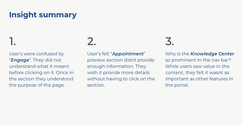
User interviews
To get the perspective of memorial sloan kettering users on the current digital experience we conducted interviews with patients and caregivers. I led remote one on one moderated video interviews with an InVision prototype. Sessions lasted 60min to 90 min.


Knowledge Center Research
Mobile Diary
In order to get an understanding of contextual sentiments that help to uncover insights, identify unmet needs and define guiding principles, I used Dscout to assign health consumers a series of video diaries to record and questions to complete. They responded with their attitudes, digital behaviors, and opinions on seeking cancer care support online. We analyzed their responses to identify broader themes in health consumer attitudes and behaviors.


User journey definition
The goal of the personas and user flows is to help the team strategically identify touchpoints by way of a realistic human story depicting how someone may interact with MyMSK, highlighting screens, content, and functionality.


Design
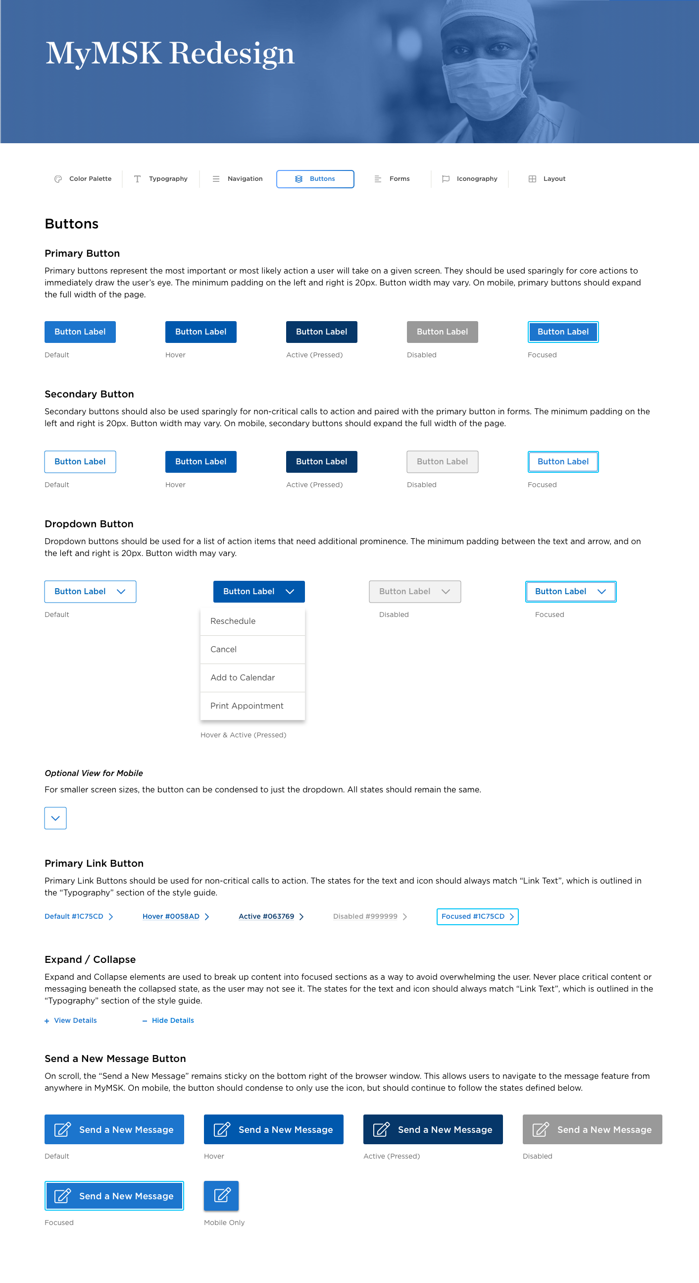
I needed to focus on addressing the shortcomings in the transition from the 2.0 to the 3.0 experience. Knowing this work would eventually support the beginnings of a design system, it was decided this effort would also propose net new features to consider further in the future.


Visual Design


Style Guide