


Click Therapeutics
Designing for Empathy: A Scalable System to Accelerate Digital Therapeutics

TL;DR
I led the creation and rollout of a company-wide design system for iOS and Android that cut release cycle time and raised accessibility across four therapeutics while keeping patient needs front and center.
50% Faster App Builds: Reduced time to code implementation from 6 months to 3 months.
Component WCAG compliance: From 60% to 95% across core UI
Component Reuse: 85% of new screens used DS components within 90 days
Role
Product Design lead
Team
1 Project manager, 6 engineers, 2 QA
Time
~10 months
My scope
Audit, system architecture, tokens, core components, docs, rollout, governance
Context
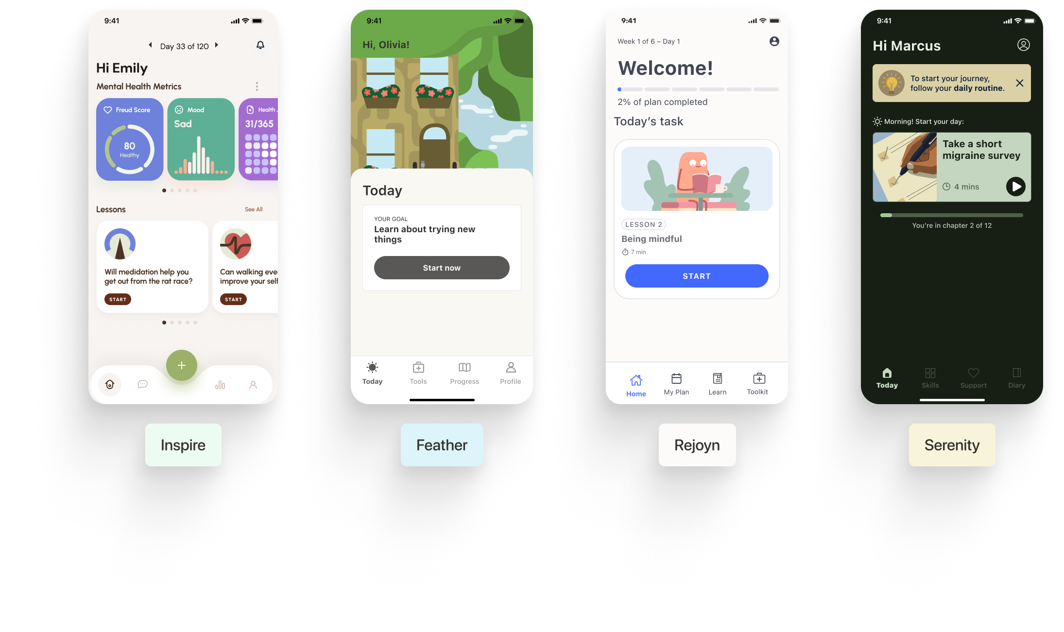
Click Therapeutics (CT) develops digital therapeutics (DTx) to treat conditions like schizophrenia, migraines, and depression. Our four product teams were individually designing and building their own experiences, which led to inconsistent naming conventions, duplicated efforts, and slow delivery.
The Challenge
We had four products shipped on different schedules, owned by different teams, with duplicated patterns and inconsistent accessibility. Developers spent time rebuilding slightly different components. That duplication created design and code drift, increased review overhead, and made it harder to track and fix accessibility issues. We needed one source of truth that aligned with our release cadence and could be adopted without blocking teams.
FDA scrutiny on copy and flows.
Legacy color palettes with low contrast.
Mixed tech stack across apps.
No prior tokens or code-linked components.

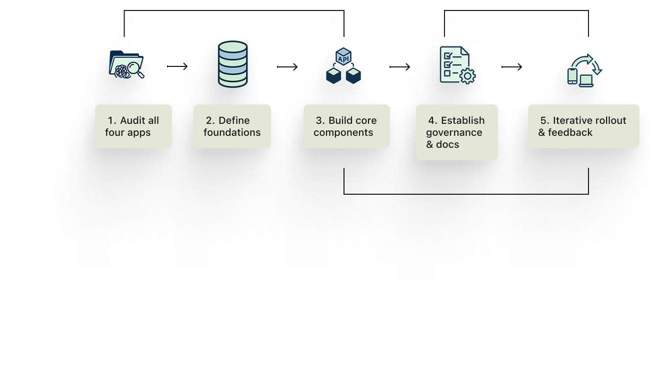
The Approach
I started with a four-app audit to catalog component variants, usage, and accessibility gaps. From that list, I defined foundations as tokens that mapped 1:1 to code names, then rebuilt the highest-leverage components first. I wrote concise usage guidance, set a lightweight contribution model, and shipped on a predictable cadence with short changelogs and migration notes. We paired with engineering on package versioning, lint rules, and basic CI checks so adoption fit the way teams already shipped.
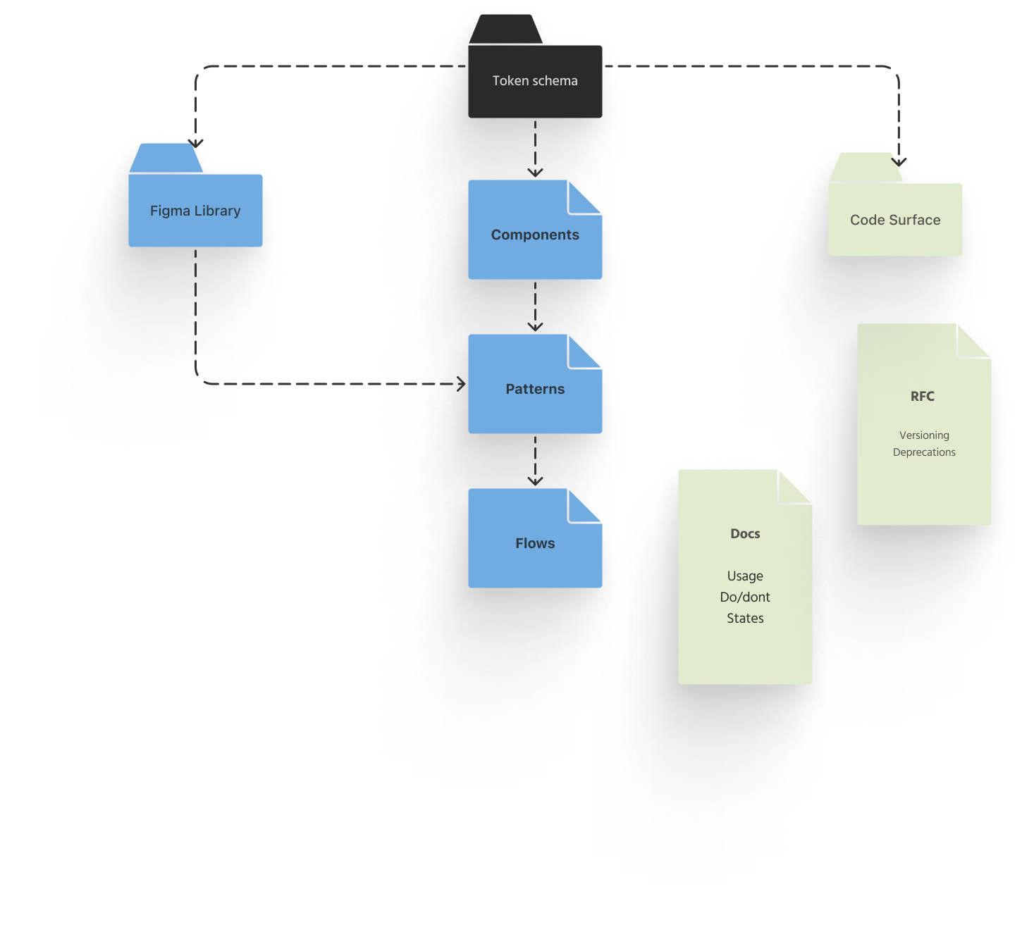
The Solution
We built a single source of truth in Figma and a corresponding code surface, both driven by the same token schema. Tokens drive components. Components compose patterns used across flows. Docs are short and opinionated. A small governance loop keeps variants from fragmenting and gives teams a clear path to propose changes.
Foundational Elements
I started with foundational elements. Our tokens for color, typography, and spacing were designed to allow each therapy to have its own unique tone without changing the underlying behavior. This allowed a single component to be restyled with different colors and fonts across our apps while using the same underlying code.
Designing the Libraries
Before giving everyone the new stuff, I had to make sure I wasn't going to break anything. Our apps were already being worked on, so I created the new components in a separate library. I basically tried my best to break them, using them in test files to make sure they wouldn’t mess up anyone else’s work.
I experimented with a few different ways to build the components in Figma. The goal was to make them easy for other designers to use and for me to maintain. I found that I could create a few core building blocks, like a "button size" or "padding amount," and then use those to build everything else. This approach kept our files from getting too big and made it easy to make a small change that would ripple across all of our components without breaking anything.


Component Library
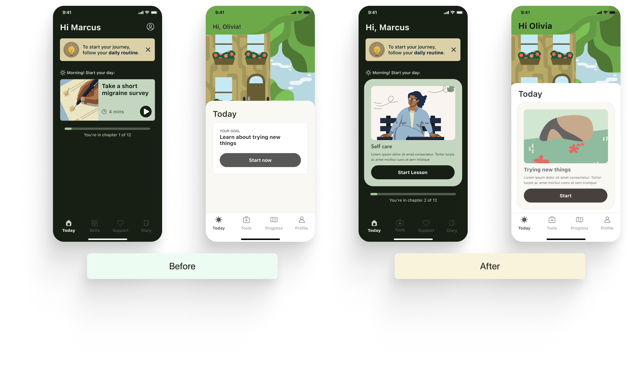
With our foundations in place, it was time to build out a robust component library. Before I did, I ran a full audit of every single component across all four apps. It was a mess. We had multiple variations of the same component and no consistency. I saw things like three different "close" icons and so many shades of gray it was hard to keep track. My goal was to create one source of truth.
I redesigned the highest-leverage components first—things like buttons, form fields, and cards—so they could be scaled across every app. The key was ensuring that they would look and behave the same way while still allowing for the brand differences of each therapeutic.

Documentation and Rollout
Finally, I worked on documentation for all foundational elements, components, and guides.
While written documentation is needed to give users of the system a place to find out everything they need to know about a design system component, education usually happens in the form of office hours, sitting in on design reviews, and training workshops.
I quickly found that why documentation was essential, it wasn’t enough to evangelize the new system and to ensure that everyone was on board with the changes we made. In order to roll out effectively, we found that creatin weekly office hours, sitting in on design reviews where the new sys was being used, and holding formal training workshop across disciplines was the most effective way to get everyone across products on board.
The Impact
We saw major wins across the board: faster deployment, fewer regressions, and a higher accessibility baseline. The most rewarding part was hearing from the teams. Before the system, I’d get messages like, "Why do we have three different colors called 'gray'? Which one am I supposed to use here?" After the rollout, the tone completely changed. An engineer told me, "The new semantic colors made it so easy for me to just grab exactly what I was looking for. It's so much easier now."
Faster Deployment
We cut the time it took to build a new app from scratch (zero to MVP) by 50%. The last app we shipped before the redesign took six months to launch. The first one after the system went live took just three.
Increased Component Reuse
Before the system, our developers were basically building the same components from scratch for every app. We went from almost no component reuse to 78% being reusable across all of our products.
Improved Accessibility
We went from a base of about 60% accessibility to a 95% WCAG pass rate. This meant our apps were more inclusive and usable for all patients.
“We used to have so much design and code drift between apps. Now, with a single source of truth in Figma and a corresponding code surface, our PR reviews are faster and our teams are more aligned. The component system has been a huge win for velocity.”
Next Steps: Scaling the Platform
Building on this foundation, our focus is on expanding the system to address more complex therapeutic challenges. We're exploring how to apply our systems thinking to new areas, including advanced therapy modules and AI-driven personalization via our Click SE™ platform, to deliver compassionate, personalized care at a global scale.